Some pencils from the page I'm working on. I like the (warning: pretentious art school talk ahead) quality of line. And non-repro blue always looks nice with normal lead, don't you think?
Cheers! Sometimes I don't want to ink on top of them...but then I think that the whole "unadorned-skinny-pencil-line-C.F-thing" is a bit of a band-wagon, and maybe wouldn't suit my "style" (such as it is) anyway...I might be wrong, I'm still in the formative stages of exploring what's right for me, you know? Actually, bollocks to all that, what I really need to work on is my writing! Thanks loads for the comments, they mean a helluva lot, mate!
I know it. Young artists often have a hard time seeing it, but the dynamic nature of someone's "style" as it's still being worked out is really quite engaging. Sometimes the execution of an idea fails, but that makes the wins so much more potent. I think that when an artist settles into a style, their work can lose a bit of vibrancy. And of course, writing is a comparable struggle. Back at you, sir.
It DOES make the "wins" so much more potent, you're totally right! Man, you're more analytical than I am about this comic art stuff...and that's no bad thing! I think it's fucking great to engage with a like-minded person who can also challenge your beliefs...that inculcates mental/artistic growth, dunnit?!? Plus I miss being in full-time education so this sort of back-and-forth is truly invaluable to me! Thanks so much--again!
 Some pencils from the page I'm working on. I like the (warning: pretentious art school talk ahead) quality of line. And non-repro blue always looks nice with normal lead, don't you think?
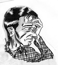
Yes, indeed. Nice line work and subtle curvature really stand out and shape an image on top of blue framework. and such is the case here.
ReplyDeleteCheers! Sometimes I don't want to ink on top of them...but then I think that the whole "unadorned-skinny-pencil-line-C.F-thing" is a bit of a band-wagon, and maybe wouldn't suit my "style" (such as it is) anyway...I might be wrong, I'm still in the formative stages of exploring what's right for me, you know?
ReplyDeleteActually, bollocks to all that, what I really need to work on is my writing!
Thanks loads for the comments, they mean a helluva lot, mate!
I know it. Young artists often have a hard time seeing it, but the dynamic nature of someone's "style" as it's still being worked out is really quite engaging. Sometimes the execution of an idea fails, but that makes the wins so much more potent. I think that when an artist settles into a style, their work can lose a bit of vibrancy. And of course, writing is a comparable struggle. Back at you, sir.
ReplyDeleteIt DOES make the "wins" so much more potent, you're totally right! Man, you're more analytical than I am about this comic art stuff...and that's no bad thing! I think it's fucking great to engage with a like-minded person who can also challenge your beliefs...that inculcates mental/artistic growth, dunnit?!? Plus I miss being in full-time education so this sort of back-and-forth is truly invaluable to me! Thanks so much--again!
ReplyDelete